Hey everyone!
This is the first of several planned Oshi Push updates that will dive deeper into what we’ve been up to since the Kickstarter campaign ended.
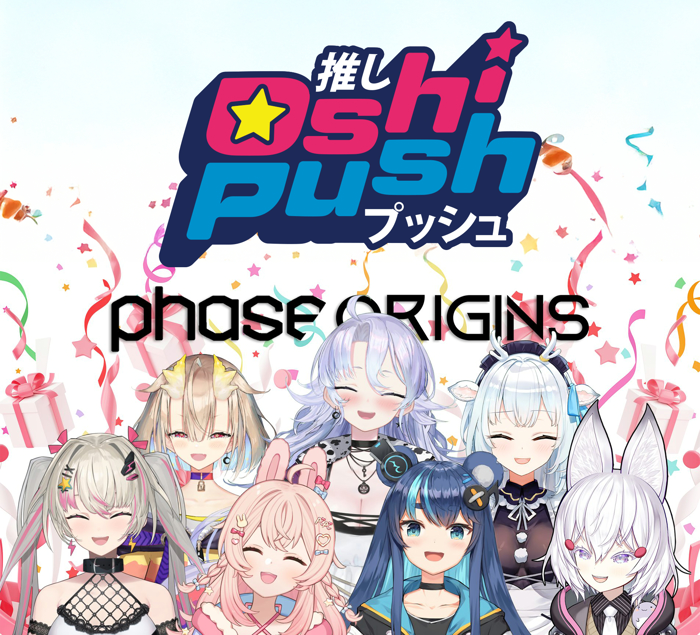
Oshi Push is Glowing Up!
Launching a brand new trading card game is a complicated endeavor. Unlike board games, a TCG is never truly finished — it is in a constant state of iteration as we receive community feedback, explore new mechanics and design space, prepare new cards for release, and work with distributors and retail partners to craft the best possible experience for everyone.
Oshi Push represents a unique challenge because of our licensing agreements with our VTuber talents. Not only are we working to make the best game possible from a mechanical and collectability standpoint, but it is incredibly important to us that we capture the feel, flavor, and fandom of each VTuber in a way that resonates with their audience.
To those ends, we have decided to give our card frames a bit of a glow up! To be clear, we loved the original frames shown during the Kickstarter and think the graphic designers who worked on them did an excellent job. But as we continued to show the game to a wider audience, we received a few pieces of consistent feedback that influenced our decision to alter the frames.
A Note on Card Legality
Rest assured: All cards that have been published so far, including the Pre-Debut promo pack cards, are still going to be 100% legal for competitive play! In fact, we expect that these “alpha” cards featuring the original frames will become quite popular among collectors and those who prefer to bling out their decks with the highest rarity, as these frames are now considered retired and will not be used on future card releases.

Trading card games often update frame art. Many popular games now include multiple frame styles in a single set. Sometimes this is done to enhance the overall flavor of the set; sometimes it’s purely collectible, but almost always it is to increase the aesthetic appeal.
The changes outlined in this post are both: we believe the new frames are aesthetically pleasing, but also more clearly articulate the rules and flavor of Oshi Push, the VTubers represented, and the culture replicated through gameplay.
Before I go deeper into the changes, I want to note that all of the cards and frames referenced here are referring to only the most basic version of the cards. Higher rarities will have alternate art and borderless treatments, which we will reveal later. For now, let’s dive into where we were versus where we are today.
Persona? I Hardly Knew Ya!
To start, let’s take a look at the original Persona card designs.
Personally, I love the original Persona cards. I think they’re fun, colorful, exciting, and do a good job of representing a game piece that is meant to be you, the player, during gameplay. I expect these will still be many players’ preferred versions as the full game releases for these reasons.
But when we decided to revamp the other card types, it only made sense to revisit the Personas, too.
During a game of Oshi Push, your persona not only represents you, but determines your gameplay strategy and deckbuilding options. It’s important that the card feels like a piece with the rest of your deck.
This is what we landed on.

The new persona frames still allow the character to shine, with fun and colorful backgrounds, but the specific information needed to play the game is more legible now. There are many smaller changes to the frames from the originals too, but I have a character limit and so can’t get into every single difference. See if you can spot them yourself!
These changes become even clearer when we compare the original Upgrade cards, which evolve your Persona into their most powerful forms, with the newly updated designs.

Aesthetic Choices
Similar updates were applied across all card types, including Content, Actions, Upgrades, and Platforms.

The original cards have these large blocks of color that felt a bit too overwhelming. They didn’t give the dimensionality of a trading card game that we wanted. Fine for board games, but not quite what we wanted for a TCG.
In the new versions, we added a white frame around the entire card and added texture, using color more precisely so that it really pops. We also refreshed each of the icons to have more visual impact to match the new look of the frames. Additionally, how cards lay in the play space became a factor in designing a more bottom heavy UI to keep all important information visible during gameplay.

Therefore, we integrated revised icons into the frame with specific UI elements that don’t rely on color to assist. But don’t worry; we still kept the specific elements we felt were important to keep our game as accessible as possible, such as visuals as well as color markers to separate icons.

We also adjusted the placement of the artwork to increase visibility of these awesome pieces. You can see an example below!

Playability and Collectability Improvements
The updated frames needed to improve playability, too, and as such we strove to increase the legibility of all the text and increase the size of all the icons.
Since our rarity system is heavily reliant on flavor, with our “common” cards called PON and so forth, we wanted to make it a little easier to understand when looking at the card how rare it is. We acknowledge Pon, Supa, Kiiro S, Magenta, etc. rares will still require some knowledge-sharing, as they are not self-evident whether they are super rare or uncommon, but we will be incorporating a key into the official rulebook for players to reference. On the cards themselves, each rarity now has a color-coded badge to make this understanding a little easier.

For more of the playability considerations, let’s take another look at graphic designer Neil’s thought process:
What does that Platform do?
Perhaps the greatest design challenge in Oshi Push has been to rethink the layout of the Platform cards.
In Oshi Push, each player comes to the game with a deck of Platform cards, which are shuffled and used to randomly set the stage for Personas to Clash over. Players take turns creating Content, using Actions, and moving their Personas to and from specific Platforms to gain Influence and Popularity, increasing their community. Once a player reaches 1,000,000 Subscribers, they win the game!
All of that is to say, Platform cards are incredibly important. They occupy a shared space on the board in which both players must easily be able to read and understand them. If the Platform text isn’t clear, then players can’t make good decisions about how they want to play.

The original Platform cards were functional, but we found in testing that they weren’t easily legible for both players in a two-player game, and even less so in three and four player variants. As such, we went back to the drawing board to develop new designs that could be read by all players simultaneously. We think we came up with something pretty great.
For an explanation of the new Platforms, let’s take another look at designer Neil’s notes:

Beyond the major changes to the Platforms, we also revised the Popularity Threshold icon so that they are reminiscent of the past, but a bit clearer.
Quick note: In previous posts, we have referred to the resource gained during gameplay to pay for other cards as “Funds”. This has been revised. Moving forward, it will be called Bits, as we believe it to be less generic and a more flavorful term.
During the game, the physical tokens used to represent Bits are called “Oshi Markers,” which are physical markers that also keep track of Popularity on a Platform card. If Player A wins a Clash, they add an Oshi Marker to the platform to designate that they have one Popularity there. We wanted to clear up the icon on the Platforms to make it clearer that it is referencing Popularity.
The confusion stemmed from us using a star icon for both Popularity and Influence for a short period of time. This was because one stat affected the result of the other and were relative to one another. We explored using a shooting star to make it different from the Influence icon but still relative to the star theme.
As with all the cards, there are too many small tweaks to list everything, but we think this gives you a good overview of the major changes to the Platform cards.
One Final Change
Perhaps the biggest, albeit easiest to miss, change to the card frames is actually what we’ve done on the back of the cards.
Originally, the card backs were all uniform regardless of card type. What we found in testing, however, was that the cards were too easy to mix up. When sleeved, this will self-correct as your persona, platform deck, and main deck can each have different color sleeves so that they’re easy to separate between games. But when playing unsleeved, like during your first game (or your hundredth demo at a convention), it wasn’t so easy.
Therefore, we added a subtle yellow frame to the back of each Persona card so it is easy to spot in a pile of cards and pull out to begin the game in play, and a nice blue frame to each of the Platform cards for the same reason. We have also changed the orientation of the Oshi Push logo on the platform cards from vertical to horizontal so it’s even easier to spot.

Wrapping Up for Now
We’re incredibly excited about these updates to Oshi Push and what they mean for both gameplay and collectability. From the revamped frames to the improved playability and aesthetic appeal, every change has been made with the goal of creating a trading card game that feels as dynamic, vibrant, and inclusive as the VTuber community itself.
We’re incredibly grateful for your continued support and enthusiasm, which drives us to make Oshi Push even better. Your feedback has been invaluable in shaping the game, and we’re thrilled to keep working together to make Oshi Push the best it can be.
We’d love to hear your thoughts on the changes — let us know in the comments below!
Stay tuned for more updates soon — we can’t wait to show you what’s next!
Keep pushing!
The Oshi Push Team